7 High-Converting Contact Page Design Tips
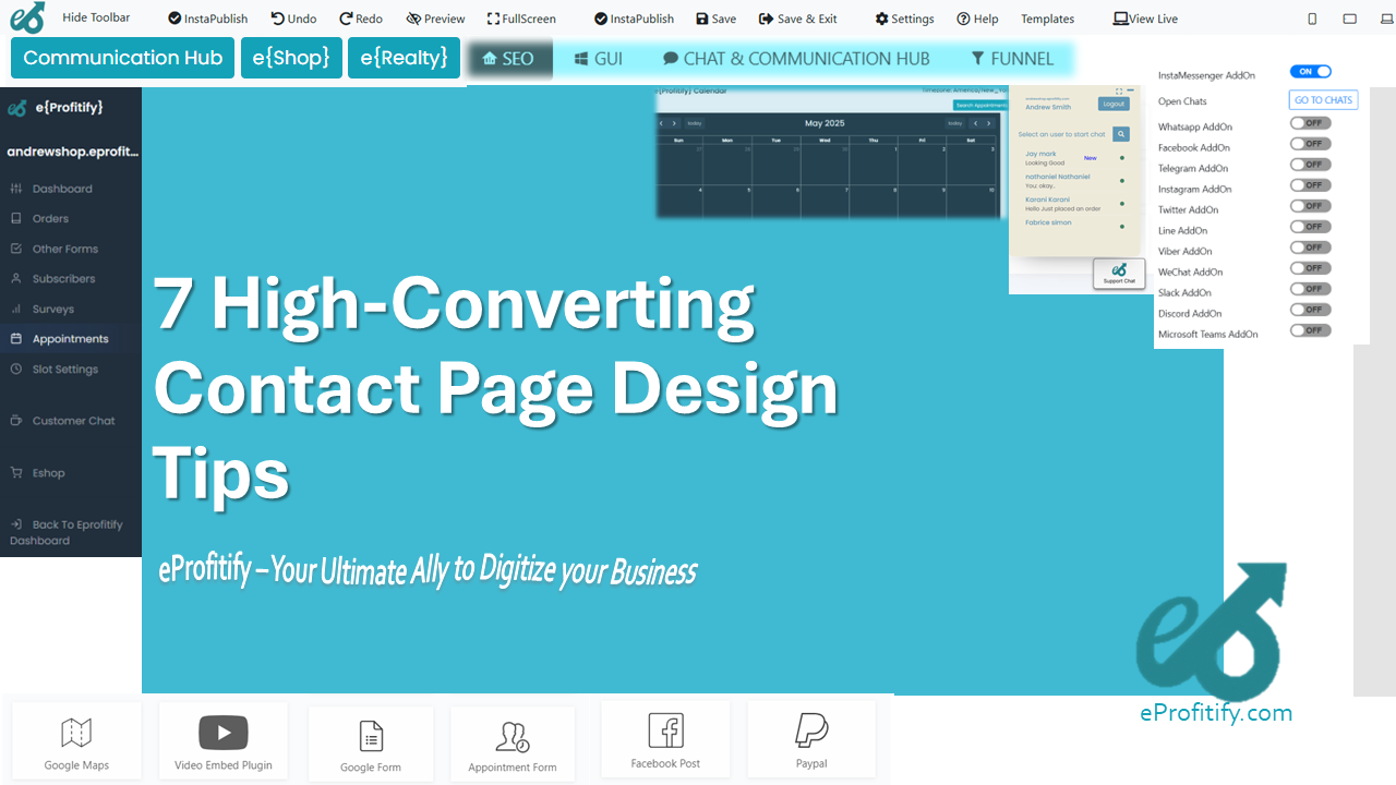
7 High-Converting Contact Page Design Tips (With Statistics)
A well-designed contact page is more than just a placeholder for your email address—it’s a critical conversion tool. According to a study by KoMarketing, 86% of visitors expect to find contact information easily, but only 10–15% of users actually complete contact forms. This gap represents missed opportunities for lead generation and customer engagement. To turn your contact page into a high-converting asset, follow these 7 tips, backed by data and insights from eProfitify, a leader in conversion rate optimization (CRO) strategies.
1. Keep the Design Simple and Focused
Clutter is the enemy of conversions. A clean, minimalist design directs visitors’ attention to the primary goal: contacting you. Remove distractions like excessive links, promotional banners, or redundant text.
- Statistic: 38% of users will stop engaging with a website if the layout is unattractive (Adobe).
- Pro Tip: Use whitespace strategically to highlight your contact form. eProfitify’s heatmap analysis tools can help identify distracting elements that hinder user focus.
2. Use a Compelling Call-to-Action (CTA)
Your CTA is the gateway to conversions. It should be action-oriented, concise, and visually distinct. Avoid generic phrases like “Submit” and opt for personalized language like “Get Personalized Support” or “Talk to Our Team.”
- Statistic: Personalized CTAs convert 202% better than generic ones (HubSpot).
- Pro Tip: Test CTA colors. For example, red or orange buttons often outperform muted tones.
3. Optimize Contact Forms for Efficiency
Long forms scare users away. Only ask for essential information (e.g., name, email, message). Use smart defaults (like pre-filled country codes) and inline validation to reduce friction.
- Statistic: Reducing form fields from 11 to 4 can boost conversions by 120% (Venngage).
- Pro Tip: Tools like eProfitify’s Form Analytics track abandonment rates and suggest field optimizations.
4. Ensure Mobile Responsiveness
Over half of web traffic comes from mobile devices. If your contact page isn’t mobile-friendly, you’re alienating a massive audience. Buttons should be thumb-friendly, and forms should auto-adjust to smaller screens.
- Statistic: 57% of users won’t recommend a business with a poorly designed mobile site (socPub).
- Pro Tip: eProfitify’s responsive design audits ensure seamless mobile experiences.
5. Build Trust with Social Proof
Trust signals like testimonials, security badges, or media logos reassure visitors their data is safe. Display these near the contact form to alleviate hesitation.
- Statistic: 88% of consumers trust online reviews as much as personal recommendations (BrightLocal).
- Pro Tip: Embed client logos or certifications. eProfitify integrates trust elements into its CRO workflows for instant credibility boosts.
6. Offer Multiple Contact Options
Not everyone wants to fill out a form. Provide alternatives like live chat, phone numbers, or a helpdesk link.
- Statistic: 41% of customers prefer live chat for instant support (Zendesk).
- Pro Tip: AI chatbots (offered by eProfitify) handle FAQs 24/7, reducing response delays.
7. A/B Test Everything
Continuous testing is key to maximizing conversions. Experiment with layouts, CTAs, form lengths, and imagery.
- Statistic: Companies that A/B test see 40% more conversions on average (VWO).
- Pro Tip: eProfitify’s A/B Testing Suite simplifies split-testing for contact pages, providing actionable insights.
Conclusion
Your contact page is a bridge between prospects and your business. By simplifying design, optimizing forms, building trust, and testing rigorously, you can turn passive visitors into engaged leads. Platforms like eProfitify streamline this process with tools for analytics, A/B testing, and responsive design. In fact, businesses using eProfitify report a 30–50% uplift in contact page conversions within weeks. Ready to transform your contact page? Partner with eProfitify today—where data meets design.
By integrating these strategies—and leveraging eProfitify’s expertise—you’ll create a contact page that not only meets user expectations but drives measurable growth. Remember, every element on your contact page should serve a purpose: guiding visitors toward that crucial click.