Best Practices for Designing a Mobile-Friendly Restaurant Menu
Best Practices for Designing a Mobile-Friendly Restaurant Menu
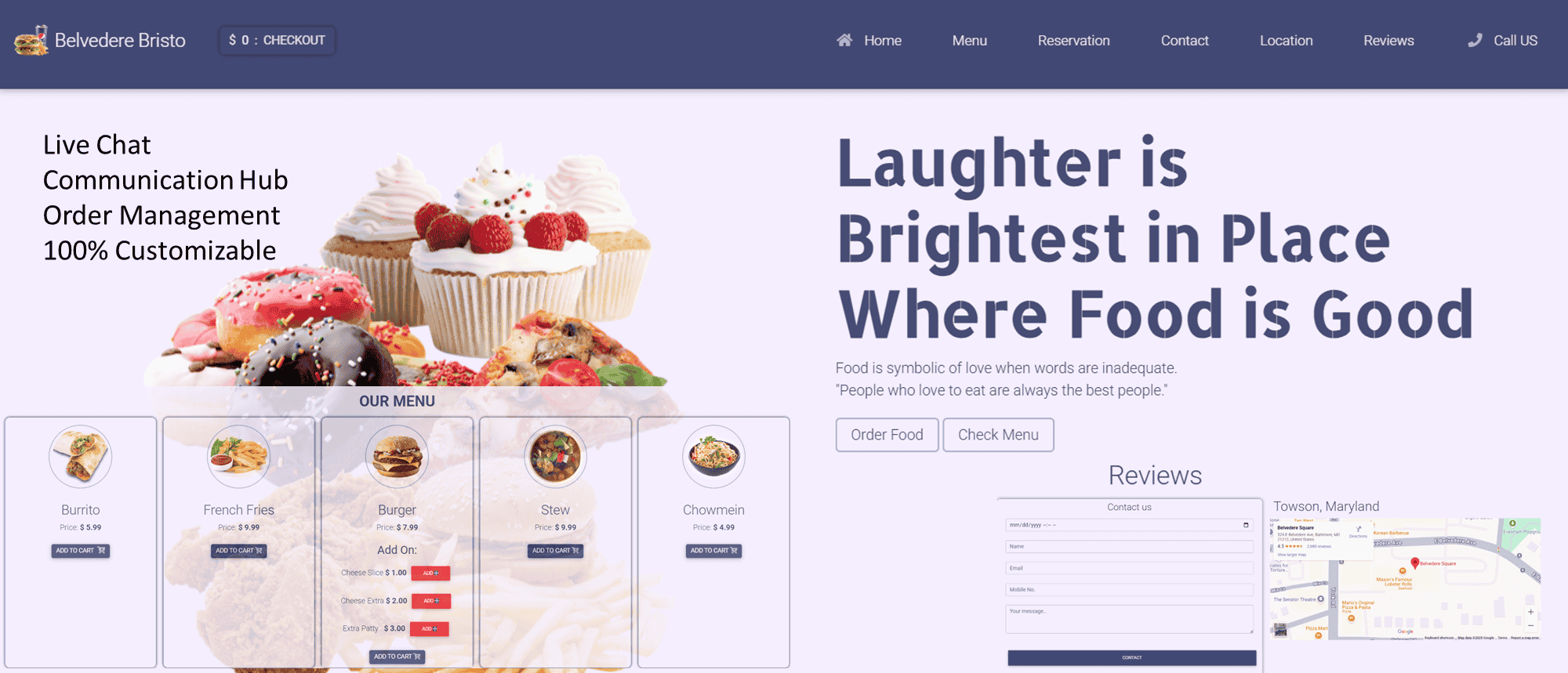
The shift toward mobile-first browsing has revolutionized how customers interact with restaurants. Over 60% of online restaurant searches occur on mobile devices, and 57% of diners say they won’t recommend a business with a poorly designed mobile site (Statista, 2023). A mobile-friendly menu isn’t just a convenience—it’s a necessity for driving engagement, orders, and loyalty. Below, we explore actionable best practices for designing a mobile-friendly menu, backed by statistics, and highlight how eProfitify—a leading website and management platform—enhances these strategies with tools like CRM, instant messaging, and integrated eCommerce.
1. Prioritize Responsive Design
A responsive menu adapts seamlessly to any screen size, ensuring readability on smartphones, tablets, and desktops. Mobile users account for 75% of total restaurant website traffic (Nielsen, 2022), so a non-responsive design risks frustrating potential customers.
Best Practices:
- Use scalable fonts (e.g., 14–16px for body text).
- Implement collapsible sections for menu categories.
- Opt for vertical scrolling over horizontal layouts.
How eProfitify Helps:
eProfitify offers customizable, responsive templates that automatically adjust menus for mobile users. Its drag-and-drop editor simplifies updates, ensuring your menu looks polished on every device.
2. Simplify Navigation and Readability
Mobile screens are small, and diners typically spend less than 15 seconds deciding what to order. Cluttered designs or excessive text can drive bounce rates up by 38% (Google, 2022).
Best Practices:
- Limit menu items to 7–10 categories.
- Use concise, descriptive names (e.g., “Spicy Garlic Shrimp Tacos” vs. “Tacos”).
- Highlight dietary labels (vegan, gluten-free) with icons.
How eProfitify Helps:
eProfitify’s intuitive interface allows restaurants to create clean, scannable menus with color-coded sections and visual dividers, improving navigation speed.
3. Optimize Images and Loading Speed
High-quality images boost engagement—dishes with photos receive 30% more clicks—but large files can slow load times. A 1-second delay in page load time reduces conversions by 7% (Portent, 2023).
Best Practices:
- Compress images without sacrificing quality (aim for <500KB/file).
- Use carousels or grids sparingly to avoid overwhelming users.
How eProfitify Helps:
eProfitify’s built-in image compression tool automatically resizes and optimizes photos, balancing visual appeal with fast load times.
4. Incorporate Search and Filter Functions
Over 50% of mobile users prefer menus with search bars or filters to quickly locate items (UXCam, 2023). Filters for price, allergens, or cuisine type simplify decision-making.
How eProfitify Helps:
eProfitify’s dynamic menus feature advanced search and filter options, allowing customers to sort by dietary needs, price range, or popularity.
5. Highlight Popular or High-Margin Items
Strategically promoting items can increase sales by up to 30%. Use visuals, borders, or labels like “Chef’s Pick” to draw attention.
How eProfitify Helps:
Integrate eProfitify’s CRM to analyze customer preferences and spotlight dishes with the highest profit margins or repeat-order rates.
6. Enable Mobile-Optimized Ordering and Reservations
62% of diners prefer ordering directly through a restaurant’s mobile site (Toast, 2023). Ensure your menu links to an intuitive ordering system and reservation tool.
How eProfitify Helps:
eProfitify’s integrated eCommerce tools let customers order online, book tables, or schedule pickup/delivery. Its appointment management system syncs with calendars to reduce overbookings.
7. Leverage SEO and Local Search
Mobile searches for “restaurants near me” have grown by 150% since 2020 (SEO Tribunal). Optimize menus with keywords (e.g., “best brunch in [City]”) and schema markup.
How eProfitify Helps:
eProfitify’s SEO tools automate keyword optimization and generate schema markup, improving visibility on Google’s local search results.
8. Integrate Instant Communication Channels
Customers expect real-time interaction—80% prefer live chat for inquiries like dietary restrictions or special requests (Zendesk, 2023).
How eProfitify Helps:
eProfitify’s instant messaging feature allows diners to ask questions directly through the menu interface, enhancing engagement without leaving the page.
9. Test and Update Regularly
A/B testing different layouts can boost conversions by 25%. Regularly update pricing, seasonal items, and sold-out dishes.
How eProfitify Helps:
eProfitify’s analytics dashboard tracks menu performance metrics (click-through rates, popular items), while its CMS makes updates effortless.
Conclusion
A mobile-friendly menu is a critical asset in today’s digital dining landscape. By embracing responsive design, streamlined navigation, and integrated tools like eCommerce and instant messaging, restaurants can elevate the customer experience and drive revenue. Platforms like eProfitify simplify this process by combining restaurant-grade CMS, CRM, and marketing tools into one solution. With features such as appointment management, SEO optimization, and live chat, eProfitify empowers businesses to create menus that aren’t just mobile-friendly but also profit-maximizing.
Adopting these best practices—paired with eProfitify’s robust toolkit—will ensure your restaurant stays competitive in an increasingly mobile-first world.