Designing a Mobile-Friendly Restaurant Website- A Step-by-Step Guide
Designing a Mobile-Friendly Restaurant Website: A Step-by-Step Guide
In today’s digital age, a restaurant’s website is often the first point of contact for potential customers. With 57% of consumers admitting they won’t recommend a business with a poorly designed mobile site (Google), optimizing your restaurant website for mobile devices isn’t just an option—it’s a necessity. Over 60% of online restaurant searches now occur on mobile devices, and 72% of diners check a restaurant’s website before dining (Statista). A mobile-friendly design improves user experience, boosts conversions, and strengthens your local SEO rankings.
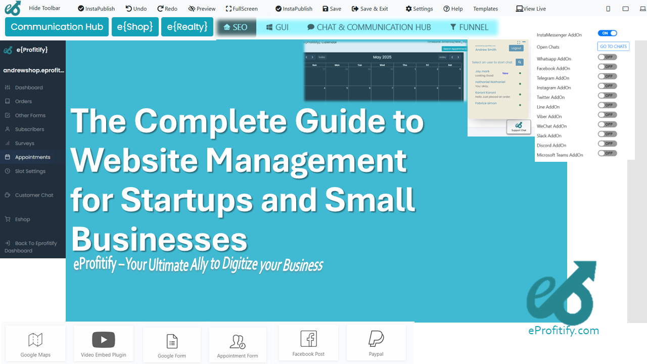
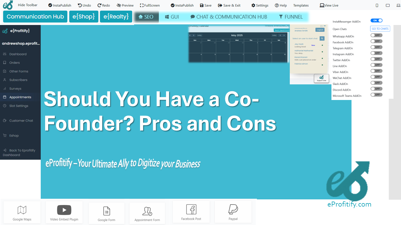
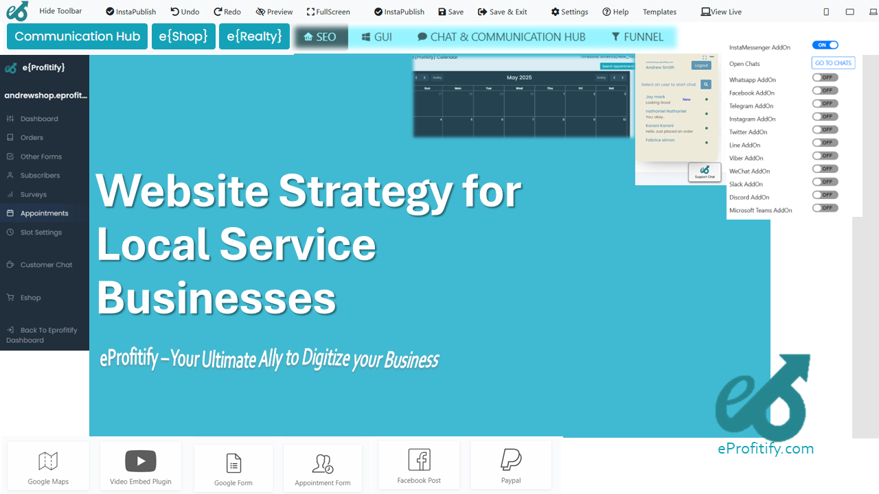
This guide breaks down the process of creating a mobile-friendly restaurant website into actionable steps and highlights how platforms like Eprofitify—a leading website publishing and management tool—can streamline the journey with features like instant messaging, CRM, appointment management, and e-commerce integration.
Step 1: Prioritize Responsive Design
A responsive website automatically adjusts its layout to fit any screen size, ensuring seamless viewing on smartphones, tablets, and desktops. Google prioritizes mobile-friendly sites in search rankings, and 74% of users are more likely to return to a mobile-optimized site (HubSpot).
How to Implement:
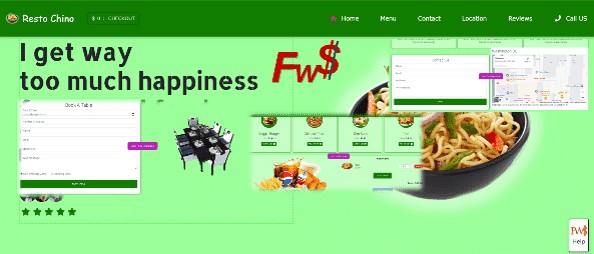
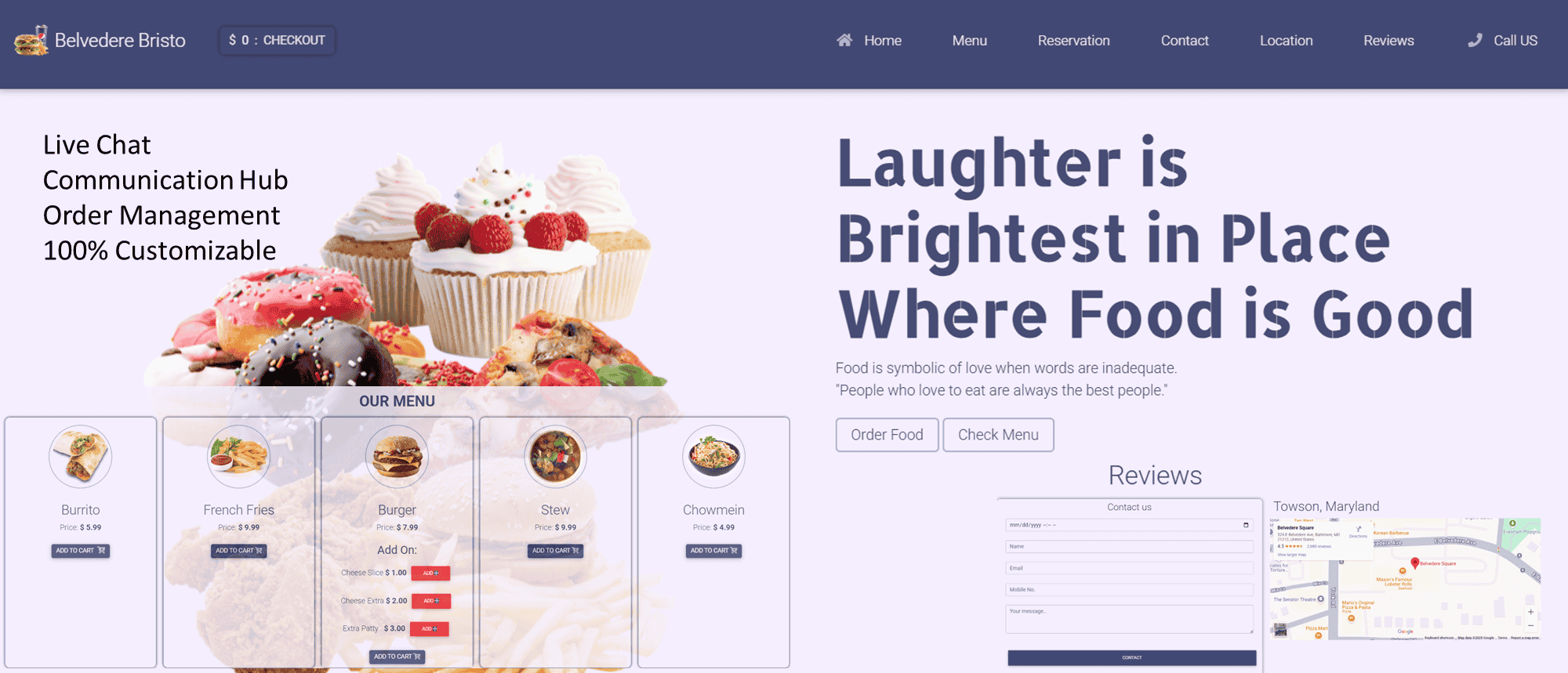
- Use a responsive theme or template. Tools like Eprofitify offer pre-built, mobile-optimized restaurant templates, saving time and ensuring technical compliance.
- Test responsiveness using Google’s Mobile-Friendly Test tool.
Step 2: Simplify Navigation
Mobile users demand quick access to information. Over 50% will leave a site if it takes more than 3 seconds to load, and cluttered menus worsen bounce rates (Portent).
Tips for Mobile Navigation:
- Limit menu items to essentials: Menu, Reservations, Location, About Us, and Contact.
- Use a sticky navigation bar for easy access.
- Eprofitify offers drag-and-drop navigation builders with collapsible menus perfect for mobile screens.
Step 3: Optimize Images for Speed
High-quality food photos entice diners, but oversized images slow loading times. Pages that load in 1 second have a conversion rate 3x higher than those taking 5 seconds (Portent).
Best Practices:
- Compress images with tools like TinyPNG.
- Use WebP or AVIF formats for faster loading.
- Enable lazy loading to defer off-screen image loading.
- Eprofitify’s built-in image optimization tools automatically resize and compress visuals without compromising quality.
Step 4: Design a Mobile-First Menu
Your digital menu is the heart of your website. Over 80% of diners view menus on their phones before visiting a restaurant (Uber Eats).
Key Considerations:
- Organize dishes into collapsible categories (e.g., Appetizers, Entrées).
- Highlight dietary labels (vegan, gluten-free).
- Link items to detailed descriptions or chef’s notes.
- With Eprofitify, you can integrate dynamic, filterable menus that update in real time across devices.
Step 5: Add Click-to-Call and Maps Integration
Local searches for “restaurants near me” have grown by 200% in two years (Google), so ensure customers can reach you instantly.
Must-Have Features:
- Click-to-call buttons for reservations or inquiries.
- Embedded Google Maps with directions.
- Eprofitify’s CRM tool captures and organizes customer inquiries, while its map integrations sync with your location data.
Step 6: Enable Online Ordering and Payments
The online food delivery market is projected to hit $1.2 trillion by 2027 (Statista). Integrating e-commerce functionality helps capture this demand.
Implementation Tips:
- Add an “Order Online” button to your homepage.
- Partner with third-party delivery apps or build your own system.
- Offer multiple payment options (Apple Pay, Google Wallet).
- Eprofitify simplifies e-commerce integration with PCI-compliant payment gateways and inventory management tools.
Step 7: Integrate Customer Engagement Tools
Engaged customers spend 23% more than average (Gallup). Use live chat, booking systems, and loyalty programs to build relationships.
Tools to Include:
- Instant messaging for real-time queries.
- Table reservation or pickup scheduling.
- Loyalty program signups.
- Eprofitify’s instant messaging widget and appointment management system automate reservations and customer interactions.
Step 8: Optimize for Local SEO
“Near me” searches drive foot traffic. Ensure your site appears in local results by:
- Adding location-specific keywords (e.g., “best pizza in Chicago”).
- Claiming your Google Business Profile.
- Encouraging reviews (53% of consumers read them before visiting).
- Eprofitify’s SEO dashboard provides actionable insights to improve local rankings.
Step 9: Test Across Devices and Analyze Performance
Check usability on iOS, Android, and tablets. Use Google Analytics to track mobile traffic patterns and bounce rates. Eprofitify includes built-in analytics to monitor page speed, conversions, and user behavior.
Step 10: Update Content Regularly
Refresh your site with seasonal menus, promotions, or events. Dynamic content keeps visitors engaged and improves SEO. With Eprofitify, updating your site is as simple as editing a document—no coding required.
Conclusion
A mobile-friendly restaurant website is critical for attracting and retaining customers in a competitive market. By following these steps—and leveraging all-in-one tools like Eprofitify—you can create a fast, functional, and visually appealing site that drives orders, reservations, and loyalty. With features spanning CRM, e-commerce, and customer engagement, Eprofitify enables restaurateurs to focus on what they do best: crafting unforgettable dining experiences.
Invest in a mobile-first strategy today, and watch your restaurant thrive in the digital landscape!