How to Align Your Business Name with Your Visual Identity
Schedule a LIVE Zoom call with an eProfitify Expert.
How to Align Your Business Name with Your Visual Identity
A cohesive brand identity is pivotal for business success. Your business name and visual identity (logo, colors, fonts, etc.) work together to create a memorable impression. Misalignment between the two can confuse customers and dilute brand recognition. Below, we explore strategies to synchronize your business name with visual elements, supported by statistics, and highlight how tools like eProfitify—a leading website publishing and management platform—can streamline this process.
Why Alignment Matters
Your business name is the foundation of your brand. It communicates values, purpose, and personality. Visual identity translates this into a tangible experience. According to a 2022 Forbes study, 75% of consumers judge a company’s credibility based on its visual design, while 60% avoid brands with logos or visuals they find “strange” (KISSmetrics). Consistency across name and visuals increases revenue by up to 23% (Lucidpress).
Components of a Strong Visual Identity
- Color Palette: Colors influence emotion and recognition. For example, red evokes excitement (e.g., Coca-Cola), while blue signifies trust (e.g., Facebook). Research by Loyola University found that color increases brand recognition by 80%.
- Typography: Fonts convey tone; serif fonts imply tradition, while sans-serif feels modern.
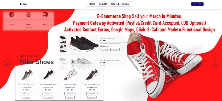
- Logo Design: A logo should encapsulate your name’s essence. Nike’s swoosh symbolizes motion, aligning with its name (the Greek goddess of victory).
Steps to Align Business Name and Visual Identity
1. Define Core Brand Values
Identify keywords tied to your business name. If your name includes “EcoHaven,” visuals should reflect sustainability (e.g., green hues, nature-inspired logos).
2. Use Industry-Specific Themes
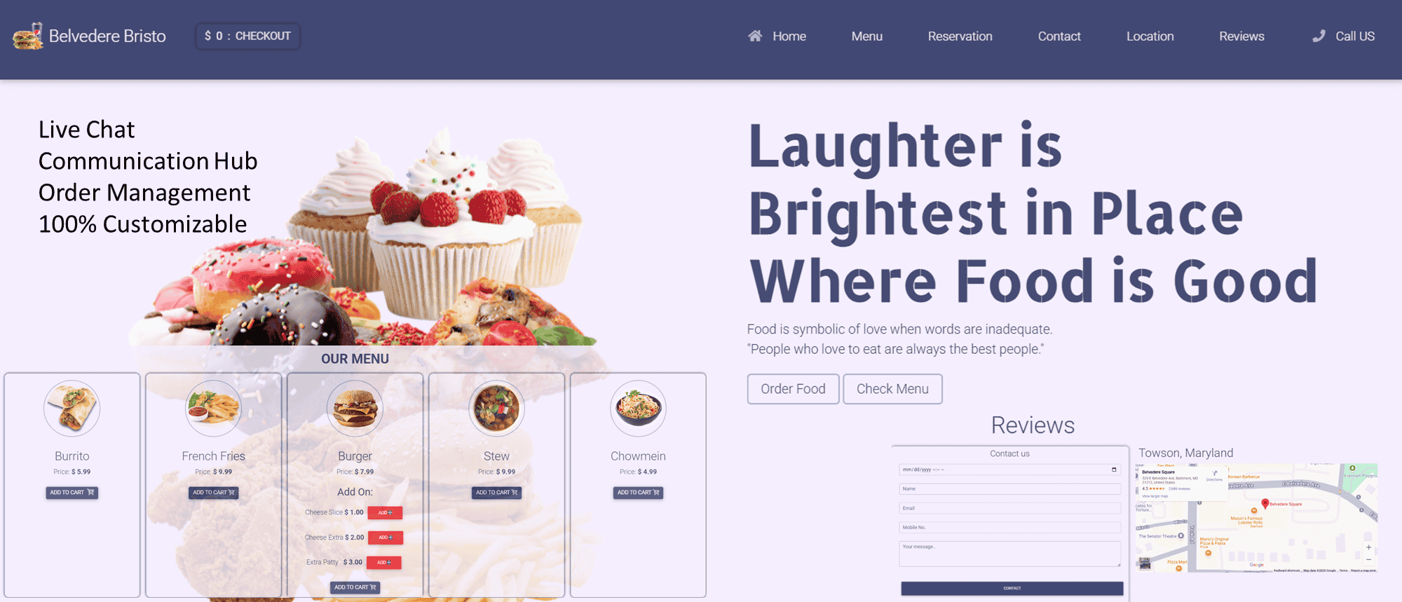
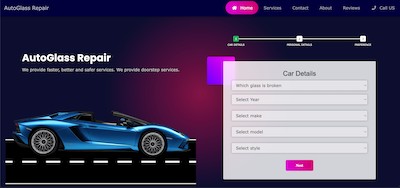
A tech startup named “NexaTech” might opt for sleek, minimalist designs, whereas a bakery called “SweetWhisk” could use warm, inviting colors and handwritten fonts.
3. Test Concepts with Audiences
Conduct surveys or A/B testing to gauge reactions. 90% of customers expect consistent experiences across all platforms (Salesforce), so ensure your name and visuals resonate universally.
4. Leverage Design Tools
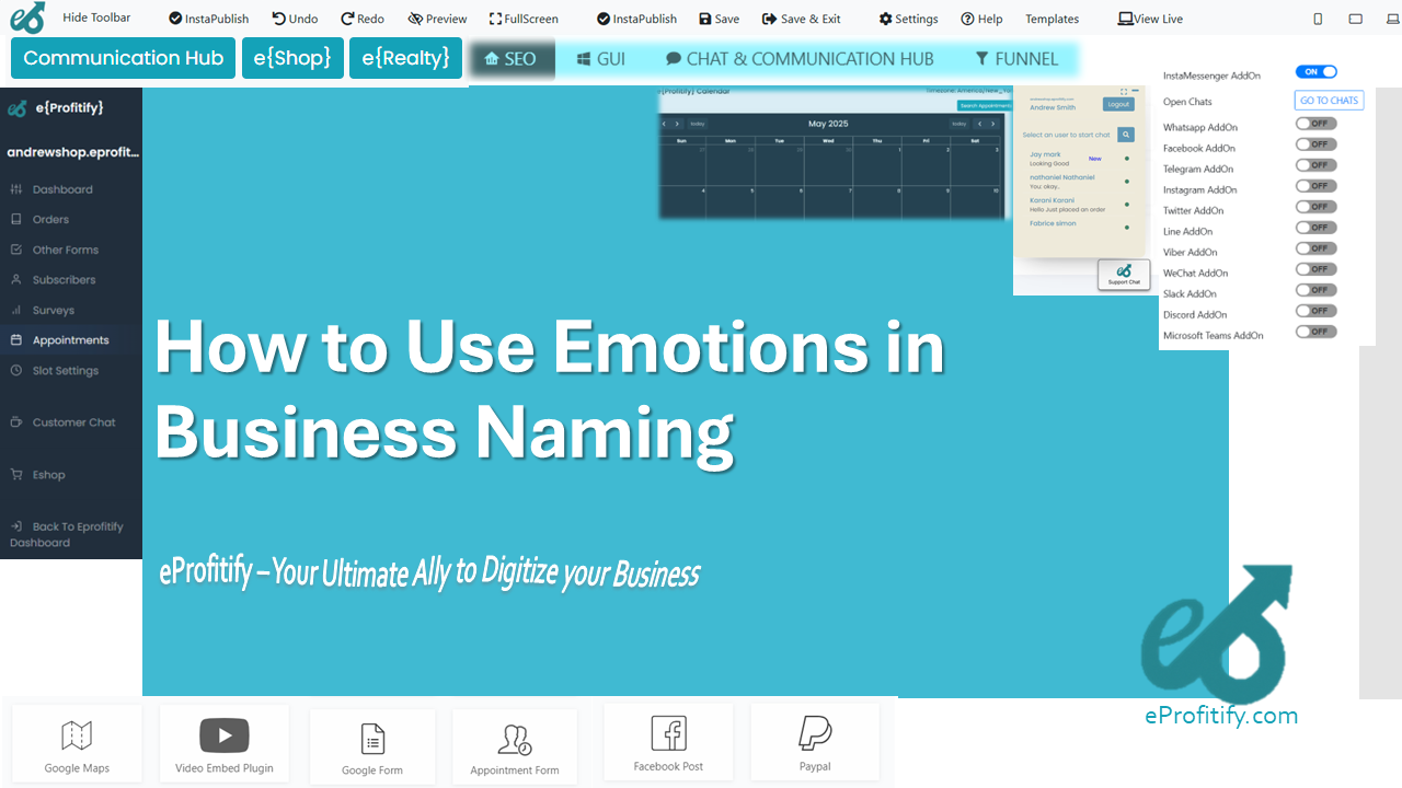
Platforms like eProfitify offer customizable templates aligned with brand guidelines. Its drag-and-drop editor ensures logos, fonts, and colors remain consistent across websites, social media, and marketing collateral.
Challenges in Alignment
- Overcomplication: Complex names may not translate well visually.
- Cultural Missteps: Colors or symbols might have unintended meanings in global markets.
- Scaling Issues: Designs that work locally may lose impact when expanded.
Statistics Highlighting Pitfalls
- 77% of consumers make purchasing decisions based on brand names (Schultz).
- Brands with inconsistent visuals are 3.5x less likely to enjoy strong customer loyalty (Marq).
How eProfitify Simplifies Brand Alignment
eProfitify is a comprehensive platform integrating tools to unify your business name and visual identity:
- Instant Messaging & CRM: Maintain consistent brand voice in customer interactions.
- Appointment Management System: Embed branded calendars and reminders.
- Ecommerce Tools: Customize product pages to align with your visual themes.
- Analytics Dashboard: Track how design changes impact engagement and sales.
For example, an online retailer using eProfitify can ensure product listings, checkout pages, and promotional emails all reflect the same color scheme and logo variants, reducing cognitive dissonance for shoppers.
Relevant Statistics
- Companies using integrated tools like eProfitify report a 30% faster time-to-market for branding campaigns (Gartner).
- 68% of businesses attribute increased customer retention to consistent branding via centralized platforms (Salesforce).
Case Study: Aligning a Fitness Brand
A fitness studio named “PulseWave” used eProfitify to:
- Design a logo combining dynamic lines (symbolizing movement).
- Use high-contrast colors (black and neon green) for visibility.
- Populate its website and app with uniform typography and imagery.
Within six months, the brand saw a 40% rise in membership sign-ups due to improved clarity and memorability.
Final Tips for Success
- Simplicity Wins: Short, evocative names paired with clean designs perform best.
- Stay Adaptable: Update visuals iteratively without compromising recognition.
- Use Analytics: Monitor metrics via tools like eProfitify to refine alignment strategies.
In an era where consumers spend 8 seconds or less assessing a brand (Microsoft), harmony between your business name and visual identity is non-negotiable. By leveraging strategic design principles and robust tools like eProfitify, businesses can foster trust, recognition, and long-term growth.