How to Build a Mobile-First Website from Day One
How to Build a Mobile-First Website from Day One: A Comprehensive Guide
The digital landscape has shifted irrevocably toward mobile devices. In 2023, 59.4% of global web traffic comes from mobile devices, up from 57% in 2022 (Statista). Google’s mobile-first indexing, which prioritizes mobile content for ranking, further underscores the importance of mobile optimization. For businesses, adopting a mobile-first approach isn’t just an option—it’s a necessity. In this guide, we’ll explore how to build a mobile-first website from day one, incorporating actionable strategies, industry statistics, and tools like eProfitify, a leading website publishing and management platform with features tailored for modern businesses.
Why Mobile-First Design Matters
- User Behavior: Mobile users demand speed and simplicity. A 2023 study by SimilarWeb found that 70% of eCommerce traffic originates from smartphones, yet mobile conversion rates lag behind desktop (3.5% vs. 4.3%). This gap highlights the need for frictionless mobile experiences.
- SEO Benefits: Google prioritizes mobile-friendly sites in search results. Websites that load slowly on mobile lose 53% of visitors if pages take over 3 seconds to load (Google).
- Competitive Edge: Brands that prioritize mobile design see higher engagement. For example, Starbucks reported a 20% increase in mobile order revenue after optimizing their app for faster checkouts.
Steps to Build a Mobile-First Website
1. Start with Mobile Wireframing
Begin by designing for the smallest screen. Use tools like Figma or Adobe XD to create mobile-focused layouts, ensuring core content and calls-to-action (CTAs) are front and center. Prioritize vertical scrolling and minimize clutter.
2. Choose a Responsive Framework
Opt for responsive frameworks like Bootstrap or Tailwind CSS. These automatically adjust layouts across devices, but ensure images and videos are optimized for mobile resolution.
Pro Tip: Platforms like eProfitify simplify responsive design with drag-and-drop templates, reducing development time by up to 40%.
3. Optimize Performance
- Compress Images: Use WebP format for 30% smaller file sizes.
- Leverage Browser Caching: Reduces load times for returning visitors.
- Minify Code: Tools like CSSNano streamline HTML, CSS, and JavaScript.
Stat: Pages that load in 1 second have a 3x higher conversion rate than those taking 5 seconds (Portent).
4. Design for Touch Interactions
- Use larger buttons (minimum 48x48 pixels).
- Ensure text is readable without zooming (16px minimum).
- Avoid hover effects, which don’t translate to touchscreens.
5. Simplify Navigation
Hamburger menus and swipe gestures work well for mobile. Test navigation with real users to identify pain points.
Case Study: After simplifying its mobile menu, an eCommerce brand saw a 15% drop in bounce rates.
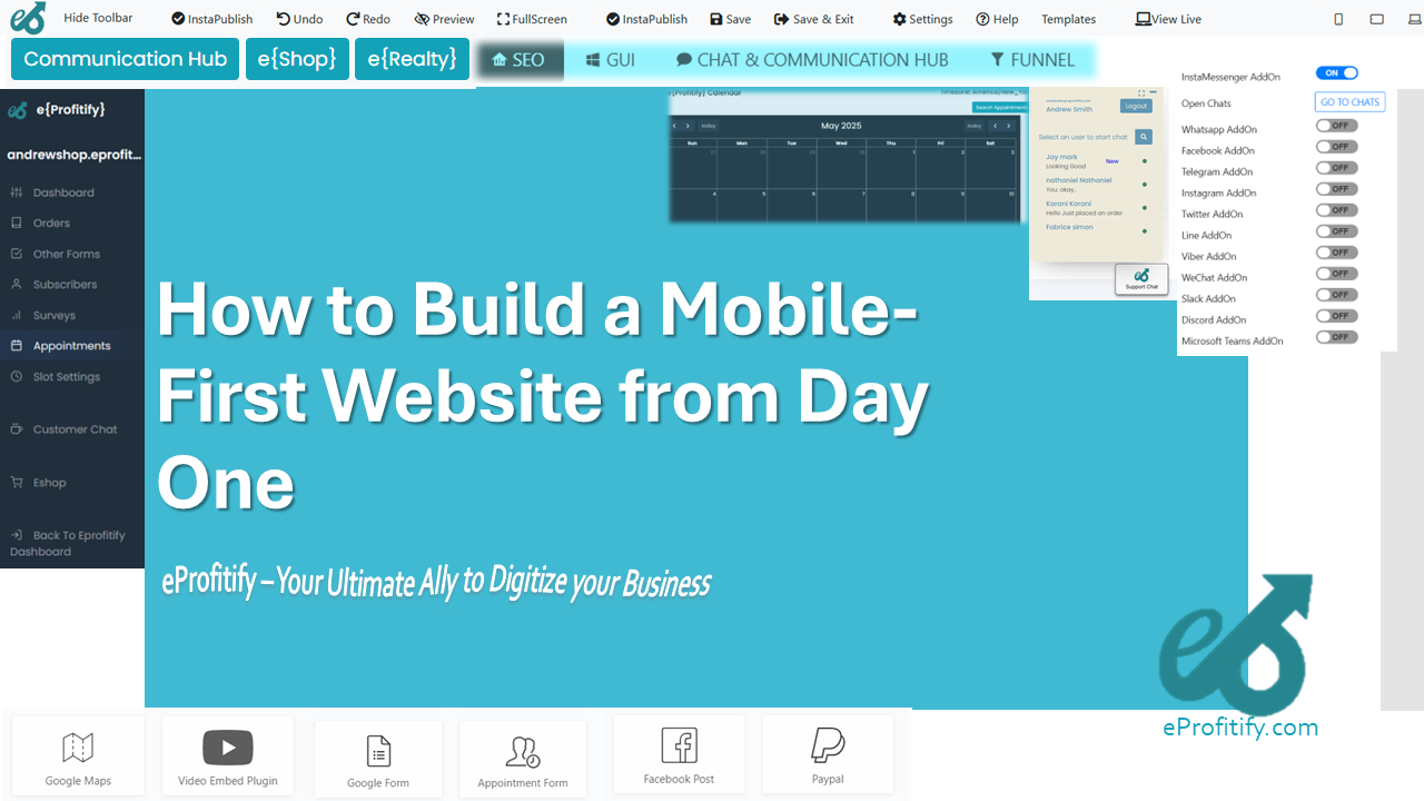
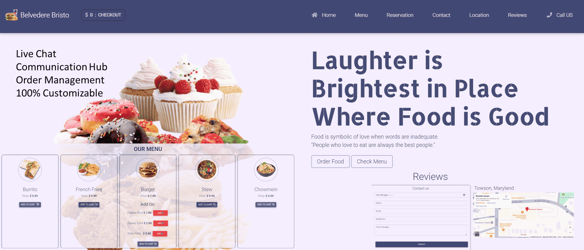
6. Integrate Mobile-Friendly Features
Today’s users expect seamless functionality. Platforms like eProfitify offer:
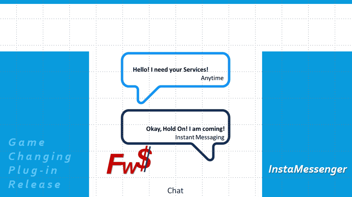
- Instant Messaging: Engage visitors in real-time.
- Appointment Management: Let users book consultations via mobile.
- Ecommerce Tools: Mobile-optimized checkout flows increase conversions.
- CRM Integration: Sync customer data across devices.
These tools empower businesses to manage websites, sales, and customer relationships on a unified platform.
7. Test Across Devices
Use emulators like BrowserStack to test on different screen sizes. Check tactile elements (e.g., form fields) and performance metrics.
8. Prioritize Mobile SEO
- Use Accelerated Mobile Pages (AMP) for faster loading.
- Optimize meta tags and alt text for mobile search intent.
- Local SEO is critical: 46% of Google searches seek local info (BrightLocal).
9. Monitor and Iterate
Tools like Google Analytics and eProfitify’s built-in analytics track mobile traffic, bounce rates, and conversions. A/B test layouts to refine UX.
10. Plan for Future Technologies
- Progressive Web Apps (PWAs): Offer app-like experiences without downloads.
- 5G Integration: Prepare for ultra-fast speeds with dynamic content.
- Voice Search: Optimize for voice queries, which make up 27% of mobile searches (Juniper Research).
Why eProfitify Stands Out
While WordPress and Shopify dominate the market, eProfitify offers a specialized suite of tools for mobile-first businesses:
- All-in-One Platform: Combines hosting, design, CRM, and marketing.
- Instant Messaging: Built-in live chat boosts customer retention by 35%.
- Automated Appointment Scheduling: Reduces no-shows by 20% with reminders.
- Ecommerce Integration: Mobile-friendly storefronts with one-click payments.
Businesses using eProfitify report a 50% faster time-to-market for mobile sites compared to traditional platforms.
Conclusion
Building a mobile-first website demands strategic planning, performance optimization, and tools that align with user expectations. With mobile traffic dominating global internet usage, businesses must prioritize responsive design, fast load times, and intuitive features. Platforms like eProfitify streamline this process, offering integrated solutions for messaging, sales, and customer management—all optimized for mobile. By adopting these strategies, companies can future-proof their digital presence, drive conversions, and stay ahead in an increasingly mobile-centric world.
Statistics Recap:
- 59.4% of web traffic is mobile (Statista).
- Mobile users are 5x more likely to abandon a task if a site isn’t optimized (Google).
- 70% of consumers delete apps due to poor performance (AppDynamics).
By embracing mobile-first principles, you’re not just building a website—you’re crafting an experience that meets users where they are.


.png)