Mobile First Indexing and Responsive Design Essentials
Schedule a LIVE Zoom call with an eProfitify Expert.
Mobile First Indexing and Responsive Design Essentials
The digital landscape has evolved rapidly, with mobile devices now accounting for 58.67% of global website traffic as of Q3 2023 (Statista). This shift has compelled search engines like Google to prioritize mobile-friendly content, leading to the adoption of Mobile First Indexing (MFI). Alongside, responsive design has become a non-negotiable standard for modern websites. Together, these concepts shape user experiences, SEO rankings, and business success.
What Is Mobile First Indexing?
Introduced by Google in 2018 and fully rolled out by 2021, Mobile First Indexing means Google predominantly uses the mobile version of a website’s content for indexing and ranking. Unlike the earlier desktop-centric approach, MFI reflects the dominance of mobile browsing. Websites not optimized for mobile risk lower visibility, as 60% of Google’s organic search visits occur on mobile devices (BrightEdge).
Key MFI statistics:
- 93% of people globally access the internet via mobile devices (We Are Social).
- 74% of users are more likely to return to mobile-friendly sites (Google).
- Mobile-optimized sites see 5x higher conversion rates than non-optimized counterparts (Portent).
Responsive Design: Core Principles
Responsive design ensures websites adapt seamlessly to screen sizes, resolutions, and orientations. Unlike separate mobile sites, responsive designs use flexible layouts, CSS media queries, and scalable assets.
Essentials include:
- Fluid Grids: Layouts adjust proportionally, replacing fixed-width structures.
- Flexible Media: Images and videos resize dynamically to prevent distortion.
- Media Queries: CSS rules apply device-specific styles (e.g., hiding elements on smaller screens).
- Touch-Friendly Navigation: Buttons and menus accommodate thumb taps, with ideal sizes of 48x48 pixels (W3C).
- Performance Optimization: Compressed images, lazy loading, and minimized code reduce load times.
Statistics highlight its importance:
- 53% of mobile users abandon sites taking over 3 seconds to load (Google).
- 75% of consumers judge a company’s credibility based on website design (Stanford).
Synergy Between MFI and Responsive Design
Mobile First Indexing and responsive design are interdependent. Google favors sites that:
- Deliver consistent content across devices (no hidden mobile/desktop discrepancies).
- Offer fast, intuitive mobile experiences.
- Use structured data and metadata optimized for mobile crawlers.
A responsive design inherently meets these criteria, reducing duplicate content risks and ensuring cohesive SEO performance. For instance, a 1-second delay in mobile load times can cut conversions by 20% (Akamai), underlining the need for speed and adaptability.
eprofitify: Streamlining Mobile-First and Responsive Strategies
Businesses seeking to align with MFI and responsive design benefit from platforms like eprofitify, a leading website publishing and management tool. Its suite of features simplifies creating mobile-optimized, responsive websites while enhancing customer engagement and operational efficiency.
Key Features:
- Responsive Templates: Pre-built designs adjust flawlessly to all devices, ensuring compliance with Google’s MFI standards.
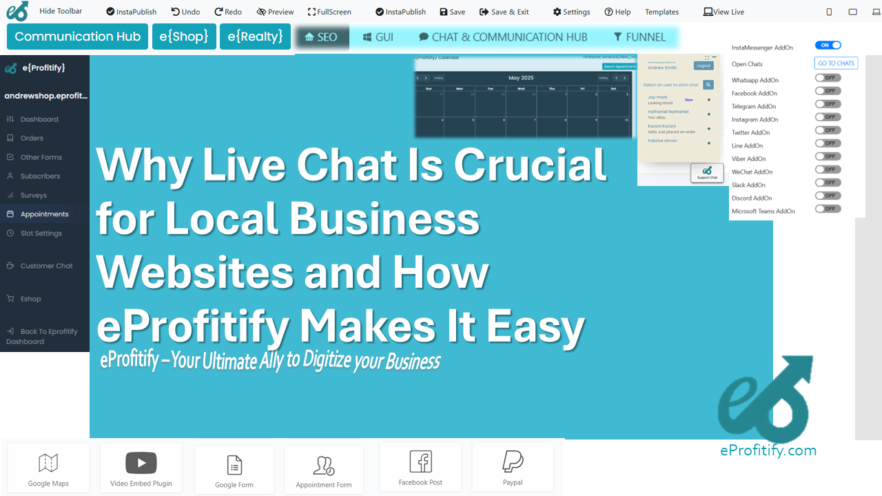
- Instant Messaging: Integrated chat tools enable real-time customer support, crucial for retaining mobile users who expect instant responses.
- Appointment Management: Automated booking systems reduce friction for mobile users scheduling services.
- Ecommerce Integration: Mobile-optimized product pages, one-click checkout, and secure payment gateways drive conversions.
- CRM Tools: Centralized customer data helps personalize mobile experiences, boosting loyalty.
- SEO Analytics: Real-time insights into mobile traffic and performance guide optimizations.
Statistics reinforcing eprofitify’s impact:
- Mobile commerce sales are projected to hit $710 billion by 2025 (Insider Intelligence), requiring tools that unify design and functionality.
- Companies using integrated CRM see 45% higher client retention (Nucleus Research).
Conclusion
Adopting Mobile First Indexing and responsive design is no longer optional. With mobile driving 65% of ecommerce transactions (Demandsage), businesses must prioritize seamless, fast, and intuitive mobile experiences. Platforms like eprofitify provide the essential tools to build, manage, and scale websites that meet modern standards while enhancing customer engagement and revenue. By leveraging its responsive templates, CRM, ecommerce, and instant communication features, businesses can thrive in a mobile-centric world.