Why Your Food Truck Website Needs a Mobile-Friendly Design
Schedule a LIVE Zoom call with an eProfitify Expert.
Why Your Food Truck Website Needs a Mobile-Friendly Design
The food truck industry is booming, driven by convenience, creativity, and the growing demand for on-the-go dining. Yet, even with mouth-watering menus and prime locations, many food trucks struggle to reach their full potential due to an outdated or poorly optimized online presence. In an era where 73% of consumers access the internet via mobile devices (Statista, 2023), a mobile-friendly website isn’t just a luxury—it’s a necessity. For food truck owners, this is especially critical, as customers often search for meals while commuting, at events, or in between daily tasks. Let’s explore why mobile optimization is essential for your food truck’s success, backed by data, and how tools like eProfitify—a leading website and business management platform—can streamline your operations while boosting customer engagement.
1. Mobile Dominates Food-Related Searches
Over 60% of Google searches for restaurants, food trucks, and takeout occur on mobile devices (Google, 2023). Hungry customers are more likely to pull out their phones to find “food trucks near me” or check your menu while standing in line at a nearby park or festival. If your website isn’t easy to navigate on a small screen, you risk losing these impulse visitors.
Statistic to note:
- 61% of users are unlikely to return to a site they had trouble accessing on mobile, and 40% will visit a competitor instead (SWEOR, 2023).
A mobile-friendly design ensures your website loads quickly, displays menus clearly, and makes key details (like your location or daily specials) instantly visible.
2. First Impressions Impact Customer Decisions
Your website is often the first interaction customers have with your brand. If it’s cluttered, slow, or requires awkward zooming, visitors may assume your food truck is unprofessional or unreliable. A responsive design adapts to any screen size, creating a polished, user-friendly experience.
Key Insight:
- 75% of users judge a business’s credibility based on its website design (Stanford University).
With eProfitify’s drag-and-drop website builder, you can create a sleek, mobile-responsive site without coding expertise. Features like instant messaging allow customers to ask questions in real-time (e.g., “Do you have vegan options today?”), fostering trust and engagement.
3. Local SEO & Discoverability
Google’s mobile-first indexing means the search giant prioritizes mobile-friendly sites in local results. If your site isn’t optimized, you’ll lose visibility in critical “near me” searches.
Statistic to note:
- “Near me” food searches have grown by 150% since 2020, with terms like “food truck near me open now” driving foot traffic (Think with Google).
eProfitify’s built-in SEO tools help optimize your site for local keywords, while integrations with Google Maps ensure customers find your location instantly.
4. Speed Matters (and Mobile Users Are Impatient)
A one-second delay in page load time can reduce mobile conversions by 7% (Portent, 2023). Food truck customers are often in a hurry, so a slow website could mean losing a sale.
Case in point:
- 53% of mobile users abandon sites that take longer than 3 seconds to load (Google, 2022).
eProfitify’s websites are optimized for speed, automatically compressing images and minimizing code bloat to keep your site lightning-fast.
5. Streamlined Ordering and Conversions
A mobile-friendly design simplifies the path to purchase. Whether you offer pre-orders, catering, or merch, customers should easily navigate menus, customize orders, and pay on any device.
Statistic to note:
- Mobile-optimized checkout processes increase conversion rates by 64% (Adobe, 2023).
eProfitify’s ecommerce tools let you accept payments, manage inventory, and even integrate with third-party delivery apps—all from a single dashboard.
6. Social Media Integration Drives Traffic
Most social media browsing happens on mobile devices. If your website isn’t mobile-friendly, clicks from Instagram posts or Facebook stories will lead to a frustrating experience.
Pro Tip:
Use eProfitify’s CRM tools to track customer interactions across social platforms and send targeted promotions (e.g., “Flash Sale: 20% off tacos this hour!”).
7. Stay Ahead of Competitors
While 83% of consumers believe a mobile-friendly site is essential, many small businesses still neglect it (Review42, 2023). A responsive site gives your food truck a competitive edge, especially at crowded events or festivals.
Example:
Use eProfitify’s appointment management system to let customers pre-order meals or book you for private events directly from their phones, reducing wait times and no-shows.
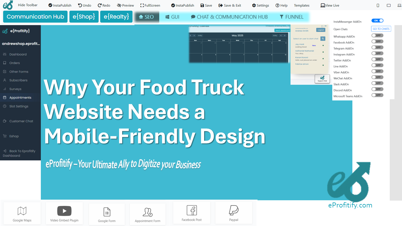
How eProfitify Solves the Mobile Challenge
Creating a mobile-friendly website from scratch can be daunting, but eProfitify simplifies the process with:
- Drag-and-Drop Builder: Design a responsive site in minutes.
- Instant Messaging: Chat with customers in real-time.
- Ecommerce Integration: Sell meals, gift cards, or merch.
- CRM & Analytics: Track customer preferences and sales trends.
- Appointment Scheduling: Manage events and pre-orders seamlessly.
With templates tailored for food trucks, eProfitify ensures your site looks great on all devices while automating operations so you can focus on cooking.
Conclusion
In a mobile-first world, a responsive website is your food truck’s digital storefront. From improving discoverability to boosting conversions, mobile optimization directly impacts revenue and customer loyalty. Platforms like eProfitify democratize advanced tools—like instant messaging, CRM, and SEO—making it easier than ever to compete in the bustling food industry.
Invest in a mobile-friendly design today, and watch your food truck thrive, one satisfied customer at a time.
*(