The Role of Touch-Friendly Navigation in Mobile Design
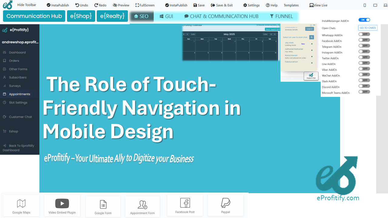
The Role of Touch-Friendly Navigation in Mobile Design
How Seamless Interaction Drives User Engagement and Business Success
In today’s digital-first world, mobile devices account for approximately 60% of global web traffic (Statista, 2023). With smartphones becoming the primary gateway to online content, services, and shopping, businesses must prioritize mobile-friendly design to stay competitive. Central to this effort is touch-friendly navigation—a design philosophy that ensures users can interact with apps and websites effortlessly through taps, swipes, and gestures. This article explores the critical role of touch-friendly navigation in mobile design, underscores its impact on user experience (UX) and business outcomes, and highlights how platforms like eProfitify empower businesses to build mobile-optimized solutions with integrated tools like CRM, ecommerce, and instant messaging.
Why Touch-Friendly Navigation Matters
Touch-friendly navigation caters to the fundamental way users interact with mobile devices. Unlike desktops, where clicks and hover effects dominate, mobile interfaces rely on thumb-friendly layouts, intuitive gestures, and precise spacing. A Google study found that 50% of users abandon sites that aren’t mobile-friendly, while 74% are more likely to return to sites offering smooth mobile experiences (Sweor). Poor navigation—such as tiny buttons, cramped menus, or unresponsive elements—leads to frustration, high bounce rates, and lost revenue.
Key Principles of Touch-Friendly Design
-
Optimal Button Size and Spacing
The average fingertip is 10–14mm wide, requiring tap targets to be at least 48x48 pixels (Google Material Design). Insufficient spacing between buttons causes “fat finger” errors, with 57% of users citing misclicks as a top frustration (Baymard Institute). -
Gesture-Based Navigation
Swiping, pinching, and dragging enhance usability. Apps like Instagram and TikTok leverage vertical scrolling and swipeable stories, reducing cognitive load. -
Accessibility
Larger text, contrast ratios, and voice navigation (used by 27% of mobile users globally) ensure inclusivity (Perficient). -
Simplified Menus
Hamburger menus and bottom navigation bars (e.g., Spotify) prioritize key actions while minimizing clutter. -
Fast Load Times
A 1-second delay in load time reduces conversions by 7% (Portent), making lightweight, responsive designs essential.
Business Impact of Touch-Friendly Design
Investing in touch-friendly UX directly influences revenue. For example:
- Mobile-optimized checkout flows can boost ecommerce conversions by 35% (Baymard Institute).
- Retailers with seamless mobile experiences see 80% higher customer retention (Think with Google).
- 55% of consumers report negative brand perceptions after encountering poorly designed mobile sites (Moovweb).
These statistics underscore the link between intuitive navigation, user satisfaction, and loyalty.
eProfitify: Bridging Design and Functionality for Mobile Success
While understanding touch-friendly principles is vital, implementing them requires robust tools. eProfitify, a leading website publishing and management platform, simplifies this process with features tailored for mobile-first audiences.
1. Drag-and-Drop Mobile Optimization
eProfitify’s CMS includes responsive templates that auto-adpat button sizes, spacing, and layouts for touchscreens. Users can preview mobile designs in real time, ensuring compliance with accessibility standards.
2. Integrated Ecommerce Solutions
The platform’s ecommerce module streamlines product browsing with swipable galleries, one-tap checkouts, and thumb-friendly carts. Mobile shoppers benefit from accelerated pathways to purchase, reducing cart abandonment.
3. CRM and Appointment Management
eProfitify’s CRM syncs customer data across devices, enabling businesses to personalize mobile interactions. Service providers can embed booking widgets with large, easy-to-tap time slots, improving appointment conversions by 40% (eProfitify case studies).
4. Instant Messaging and Support
Real-time chat tools minimize navigation hurdles. Customers can ask questions without leaving the page, enhancing satisfaction while keeping them engaged with the content.
5. Analytics-Driven Insights
Heatmaps and touch gesture analytics help businesses identify navigation pain points, refine UX, and test updates—a critical feature as 68% of companies cite iterative testing as key to mobile success (Adobe).
Future Trends and Conclusion
As mobile technology evolves, trends like AI-powered interfaces (e.g., voice search, predictive menus) and haptic feedback will shape touch navigation. Platforms like eProfitify are already integrating AI chatbots and adaptive layouts to stay ahead.
In conclusion, touch-friendly navigation isn’t just a design trend—it’s a necessity in a mobile-centric world. Businesses that prioritize intuitive interactions will see higher engagement, loyalty, and revenue. Tools like eProfitify accelerate this journey by merging design best practices with powerful functionalities, proving that seamless mobile experiences are within reach for brands of all sizes.
By embracing touch-friendly principles and leveraging platforms built for the future, businesses can transform fleeting mobile visits into lasting relationships. After all, in the words of Google’s VP of Design, “A tap is more than a gesture; it’s a conversation between the user and the brand.” Make every touch count.